DeFi Execution Audit
Morpho
Flow Reviewed
Borrow, Morpho Blue
Asset Pair
USDC against WBTC collateral
Date
May 2026
Prepared By
Daniele Damiani
Scope
This audit covers the end-to-end borrowing flow on Morpho Blue, from market selection through transaction confirmation. All observations were made on the production interface at app.morpho.org, desktop, May 2026.
Not covered: MetaMorpho vault mechanics, liquidation flows, position management, and mobile experience.
1Executive Summary
Morpho Blue's borrow flow breaks at the first decision point. Users arrive at market selection and face multiple markets for the same asset pair, differentiated only by curator icons they have no framework to interpret. There is no default, no recommendation, and no explanation of why multiple markets exist. Every subsequent step depends on this choice, including liquidity and curator risk profile, yet the interface provides no guidance before it is made.
The flow then requires multiple wallet signatures across collateral supply and borrowing without explaining what each signature authorises. Risk communication is deferred: the only explicit liquidation warning appears at the review modal, after the user has already chosen an amount. The result is an interface that rewards users who already understand Morpho and adds compounding friction for everyone else.
Primary Decision Moment
Market selection, Step 1
Friction Points Identified
4
Highest Risk Issue
Undifferentiated market list, curator icons without context
Overall Execution Risk
High
2Execution Flow Map
3Friction Inventory
Category
Information architecture
Location
Borrow, market selection step
Description
Users selecting a WBTC/USDC market are shown multiple options with the same collateral, same loan token, and the same LLTV (86%). The only visible differentiator is the "Trusted By" column, which displays curator icons with no labels or explanation. The list is flat: no recommended default, no explanation of what the liquidity difference between markets means for execution, and no indication of why multiple markets for the same pair exist.
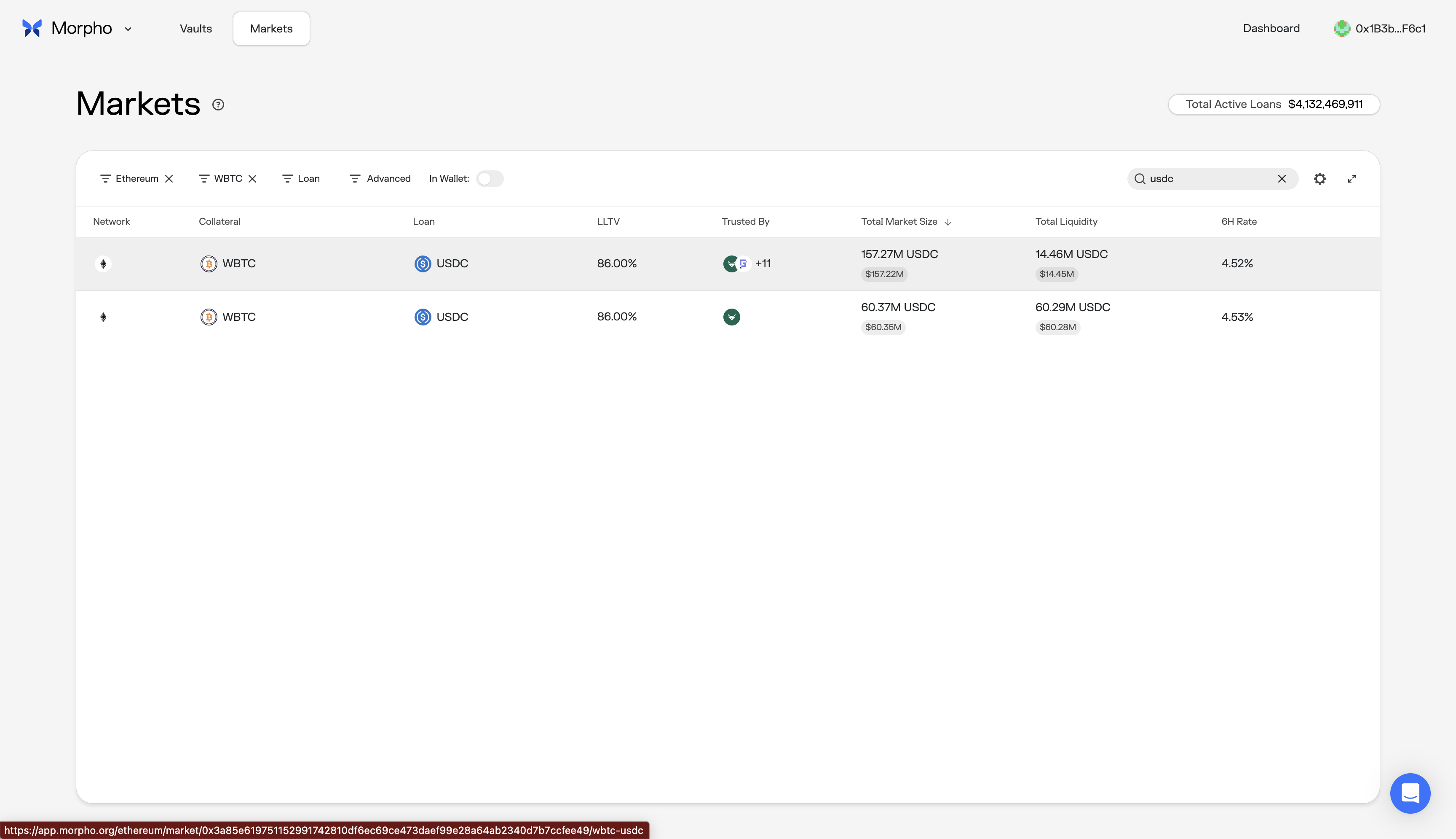
User Impact
Users either pick arbitrarily, potentially choosing a low-liquidity market with worse execution, or abandon the flow to research externally. Both outcomes represent a failed first step.
Why It Matters
This is the first consequential decision in the flow. Available liquidity and curator risk profile both depend on it. When identical-looking rows differ only by an unlabelled icon column, the interface is asking users to make a decision without giving them the information to make it.
What I'd Change
Surface the highest-liquidity market as the default, with a "Recommended" label. For additional markets, show curator names in plain text alongside a one-line description of their risk profile. If two markets share the same LLTV, the differentiator must be visible and explained, not hidden behind icon tooltips.
Category
Risk communication
Location
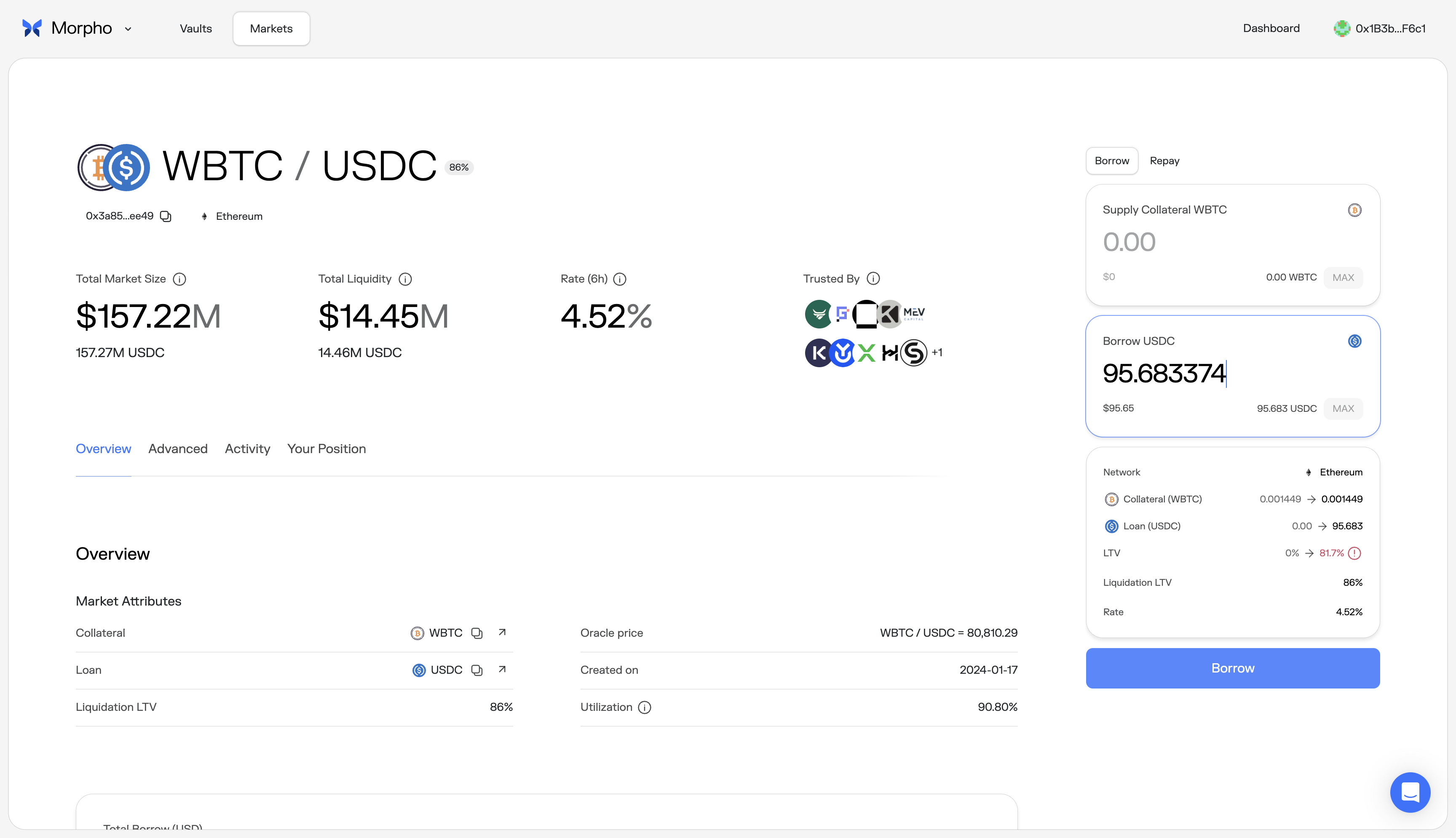
Borrow amount entry, LTV indicator
Description
The sidebar displays LTV and Liquidation LTV (86%) but provides no guidance on what LTV range is considered safe before the user enters a borrow amount. As the user types, the projected LTV updates reactively (e.g., 0% to 81.7%) with a red warning icon when approaching liquidation. The only explicit warning appears at the review stage: "You are close to being liquidated." No recommended range is shown at the input stage.
User Impact
Users have no target to aim for while entering an amount. A user who types the maximum borrowable amount sees 81.7% against an 86% liquidation threshold, but has no way to know whether 60% or 70% would be a prudent target. The result is either over-borrowing by confident users or trial-and-error by cautious ones.
Why It Matters
The LTV ratio is the primary mechanism determining liquidation risk. Showing users the projected number without a recommended range forces them to discover safe territory reactively. The liquidation warning only appears at review time, after the user has already committed to an amount.
What I'd Change
Before the user enters any amount, show a recommended LTV range in the sidebar: "We recommend staying below 70% LTV to reduce liquidation risk during volatility." Add a visual marker on the LTV display at the recommended threshold. This converts the reactive number into proactive guidance.
Category
Trust signal
Location
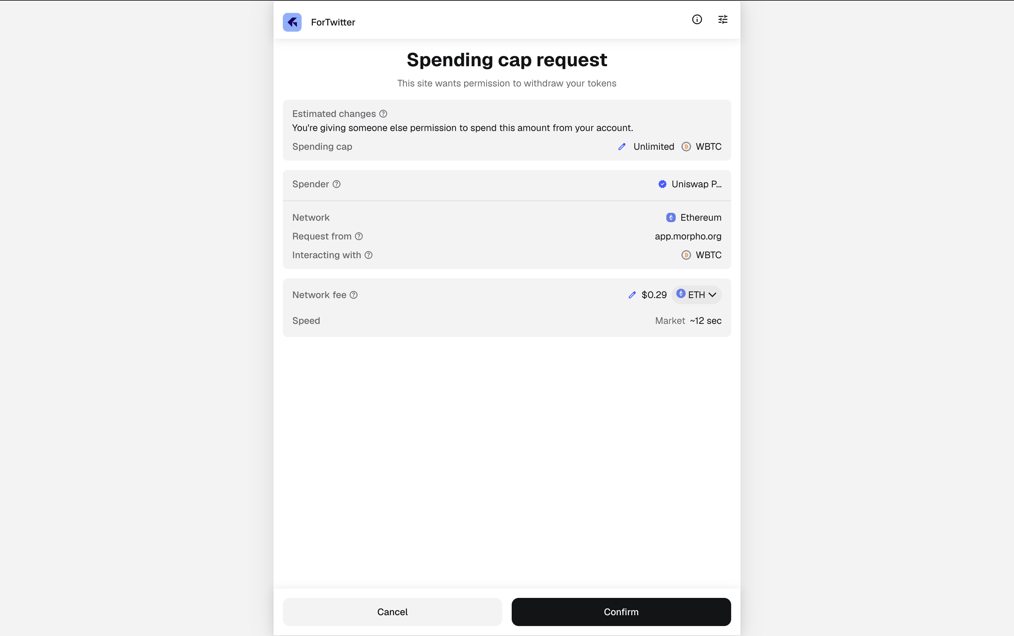
Collateral approval and borrow authorization, wallet prompts
Description
The full borrow flow requires multiple wallet signatures across two phases: supplying collateral (Permit2 approval, spending cap, supply transaction) and borrowing (authorization signature, borrow transaction). Morpho's confirm modal shows a progress bar with step segments, but no plain-language explanation of what each signature authorises or why it is needed. The wallet itself displays a "Spending cap request" or "Signature request" with contract addresses and technical fields (Nonce, Deadline, IsAuthorized) that provide no orientation to a non-expert user.
User Impact
Users who have encountered phishing attempts will pause at each wallet prompt. The first signature in particular, an unlimited Permit2 spending cap for a contract address, is indistinguishable from a malicious approval request without external knowledge. Even experienced DeFi users experience hesitation when signing multiple approvals in sequence.
Why It Matters
Approval anxiety is addressable with plain-language context. When the wallet shows "Spending cap: Unlimited WBTC" with no in-app explanation, it creates the exact conditions that phishing attacks exploit. Users learn to second-guess legitimate protocols.
What I'd Change
Add plain-language context to each step in the Morpho confirm modal before the wallet opens. For collateral supply: "Step 1: Allow Morpho to access your WBTC. This does not move any funds." For the borrow authorization: "Step 1: Authorize Morpho to execute your borrow. This is a signature, not a transaction." The progress bar already exists; it needs labels.
Category
Commitment moment design
Location
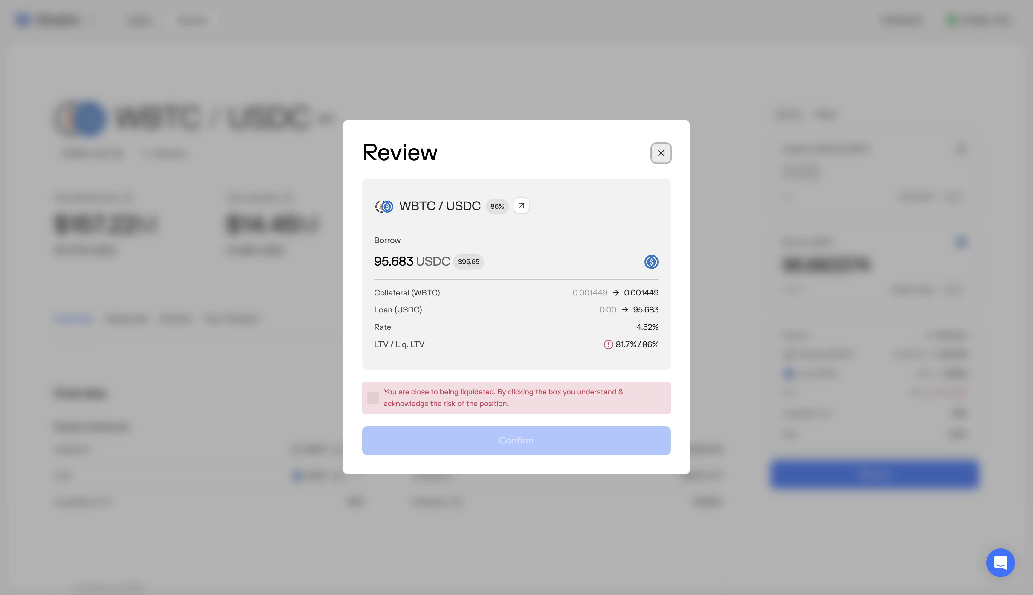
Borrow review modal, pre-confirmation
Description
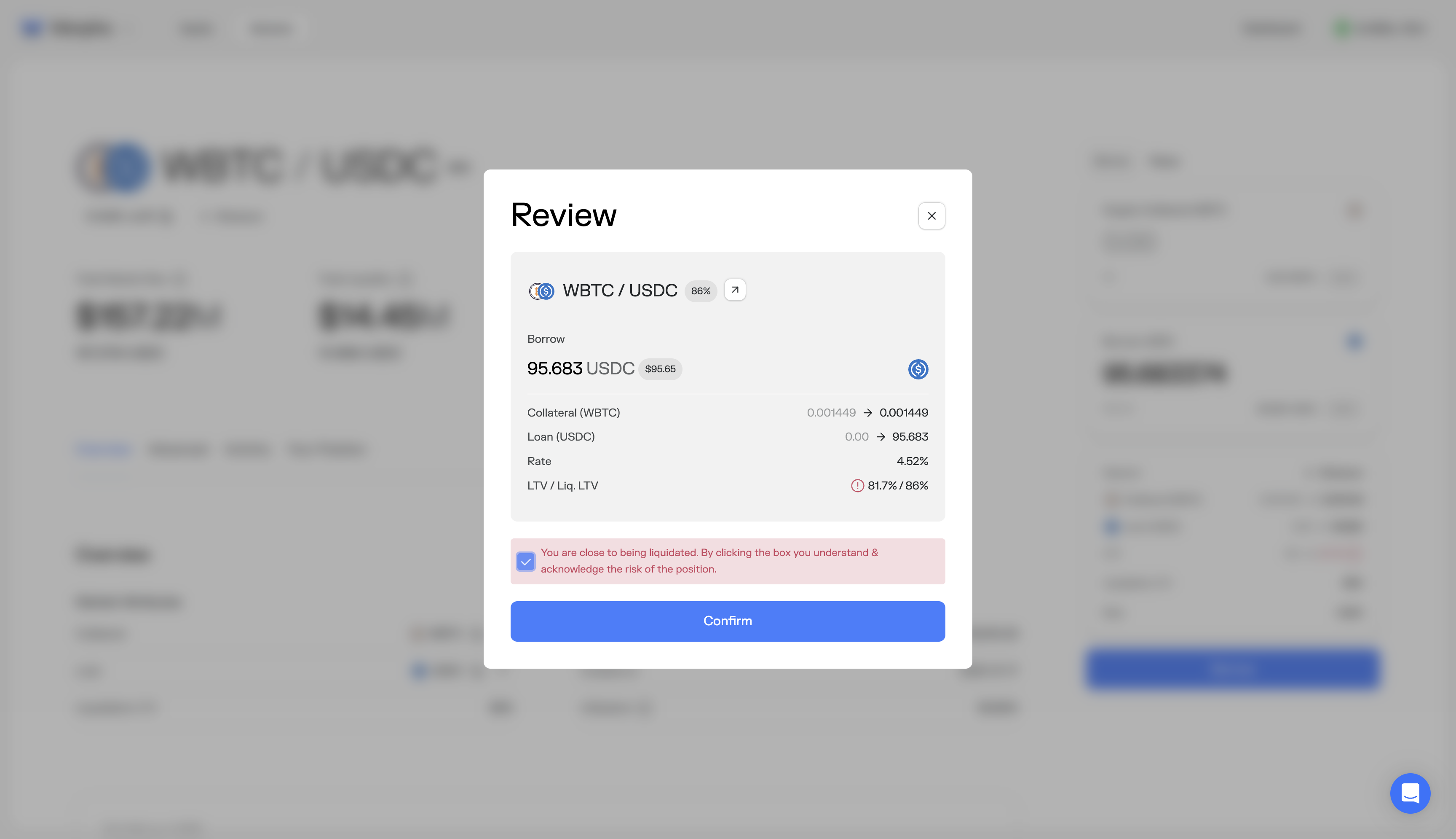
The borrow review modal shows: borrow amount, collateral, loan transition, rate, and LTV/Liq. LTV (e.g., 81.7%/86%). When LTV is near the liquidation threshold, a red warning appears: "You are close to being liquidated. By clicking the box you understand & acknowledge the risk of the position." The user must check a box to enable the Confirm button. The warning is the first explicit risk communication in the entire borrow flow, appearing only after the user has entered an amount, clicked Borrow, and reached the review modal.
User Impact
Users encounter the liquidation warning at the point of highest commitment, when they have already decided on an amount and expect to confirm. The checkbox acknowledgment creates a binary choice (accept risk or go back and guess a safer number) without telling the user what a safer number would be. Users who want to reduce risk must close the modal, adjust their amount by trial and error, and re-enter the review flow.
Why It Matters
Risk communication at the confirmation stage is too late to be useful guidance. It becomes a speed bump rather than a decision aid. The user needed this information at the input stage, where they could adjust their amount with a clear target in mind. By the review stage, the warning can only create doubt, not inform action.
What I'd Change
Move the LTV risk guidance upstream to the borrow input stage. Show a recommended maximum LTV (e.g., "Stay below 70% for a buffer against volatility") while the user is typing their amount. At the review stage, reinforce confidence rather than introducing doubt: show the post-borrow position summary prominently (collateral value, loan amount, LTV, distance to liquidation) so the user can verify their decision in two seconds.
4Commitment Moment Analysis
Primary Commitment Screen
Borrow review modal, before wallet authorization signature.
Verification Clarity
The review modal shows borrow amount, collateral, loan transition, rate, and LTV/Liq. LTV (e.g., 81.7%/86%). The data is concise but all items receive equal visual weight. When LTV is near the liquidation threshold, a red warning appears with a checkbox acknowledgment. Post-borrow position details (collateral value in dollar terms, distance to liquidation) are not shown.
Trust Reinforcement
Mixed. The liquidation warning with checkbox acknowledgment is a responsible safeguard, but it appears only at the review stage, making it the first explicit risk communication in the flow. A user who is 90% committed encounters a red warning and a mandatory checkbox, which creates doubt rather than confidence at the moment of highest intent.
Execution Risk Assessment
High. The commitment screen is the last moment to reinforce confidence before signing. Introducing the first risk warning here, rather than at the input stage where the user could act on it, converts the review modal from a confirmation step into a decision point. Users who want to reduce their LTV must close the modal, guess a safer amount, and re-enter the flow.
5Risk Prioritization
| Friction | Category | Risk | Fix Complexity | Priority |
|---|---|---|---|---|
| Undifferentiated market list | Information architecture | high | Medium | 1 |
| Risk warning deferred to review | Commitment moment design | high | Low | 2 |
| Wallet signatures lack context | Trust signal | medium | Low | 3 |
| No safe LTV range at input | Risk communication | medium | Low | 4 |
6Structural Recommendations
Default to a recommended market. Surface the highest-liquidity market with a "Recommended" label. Show curator names in plain text with a one-line risk description. When markets share the same LLTV, the differentiator must be visible and explained.
Move risk guidance upstream to the borrow input stage. Show a recommended maximum LTV while the user is entering their amount, not after they have already committed to a number. The review modal should reinforce confidence, not introduce the first warning.
Add plain-language labels to each step in the multi-signature flow. The progress bar segments already exist in the confirm modal. They need text: "Approving access to your WBTC," "Executing collateral deposit," "Authorizing borrow." Approval anxiety is a known, solved problem.
Show a post-borrow position summary at the review stage. Collateral value, loan amount, current LTV, distance to liquidation in percentage points and dollar terms. The user should be able to verify their position in two seconds before signing.
Next Steps
This audit covers one flow. Most protocols have three to five flows with similar friction patterns, each compounding the drop-off of the last. A full execution audit covers all critical surfaces: supply, borrow, repay, and position management. Deliverables include annotated screenshots for each friction point, implementation-ready recommendations ranked by impact and fix complexity, and a one-hour walkthrough with the product team.